Guides
Flow
Flows are a series of steps that a user progresses through.
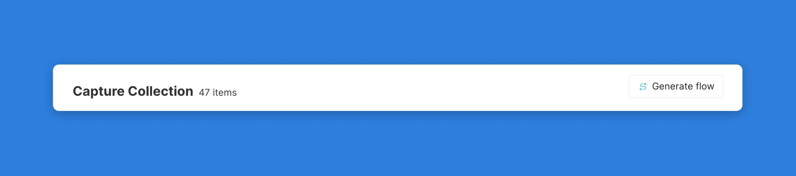
Generating a Flow
Once you are ready, select the Generate Flow button from the Capture Collection. To start building your guided walkthrough to overlay on top of the Captures.
After clicking generate a flow, you will be brought to a new screen where you can create your first flow for this set of Captures. You will notice that each Capture has been assigned to a Modal step in the order in which they were collected. We will be able to reorder steps, add new steps, and change the step types as we start to build out this flow.
Changing a Flow step
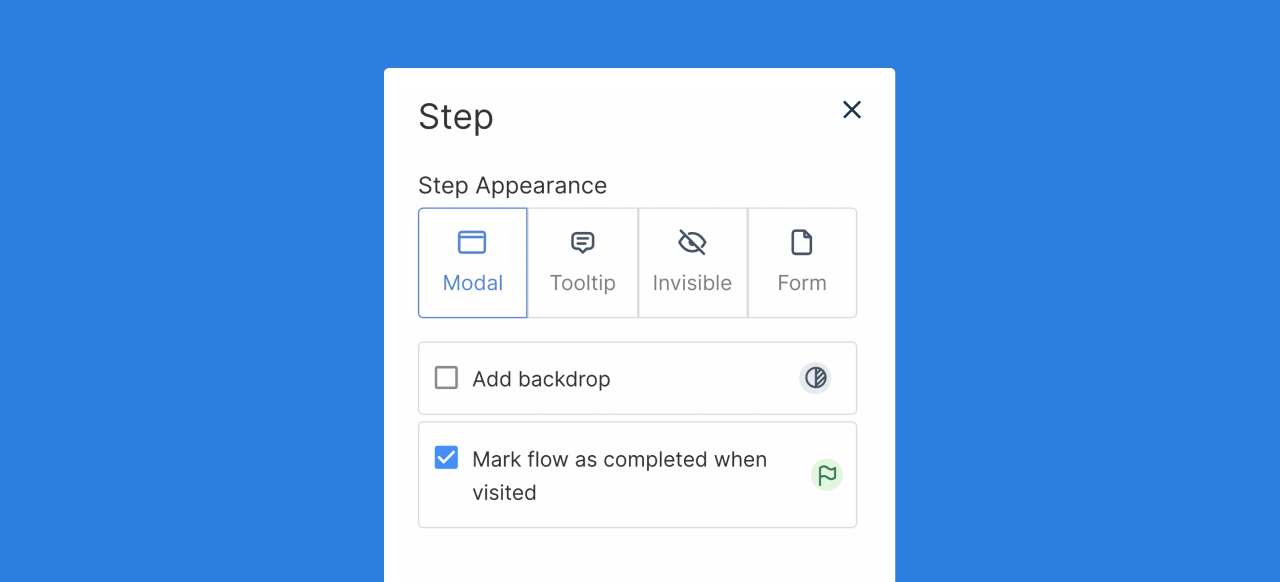
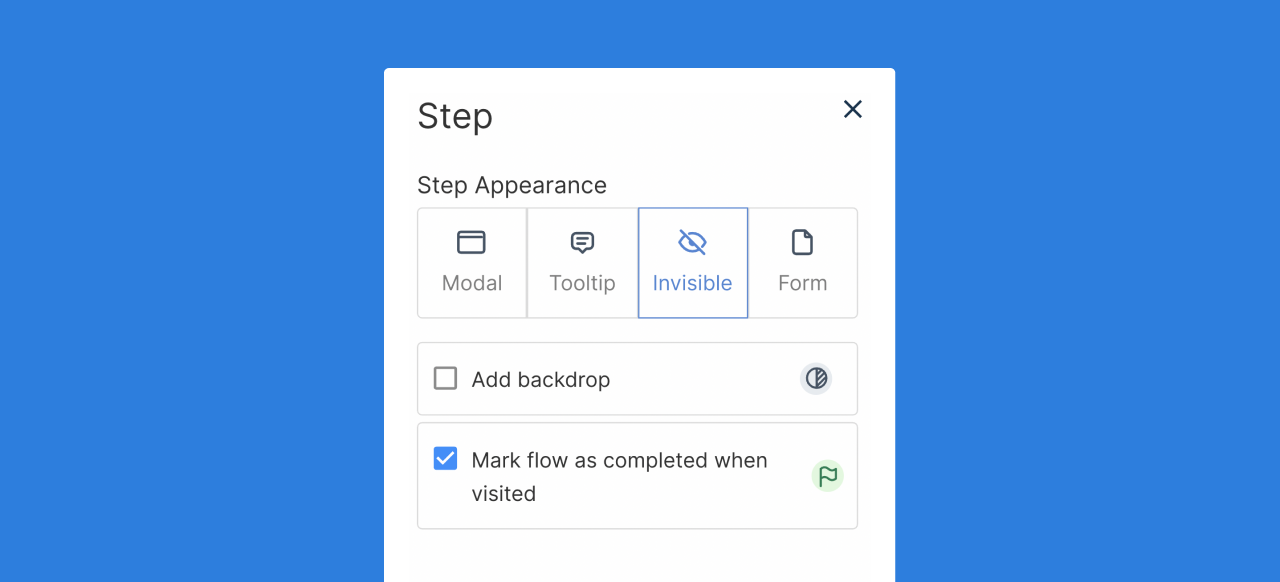
By default, the flow step will appear as a modal (popup text box) on the screen for a viewer. We can change the layout of these steps. To do this, first select the gear icon on the step.

Next, we can select a new Step Appearance to change the selected step type. From this menu, we can also add a backdrop to a step (a darkened background to make the flow step really pop) or mark the flow as completed when the step is visited (to signal the last step in a flow sequence).
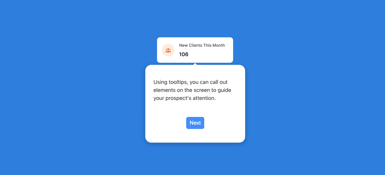
Working with tooltips
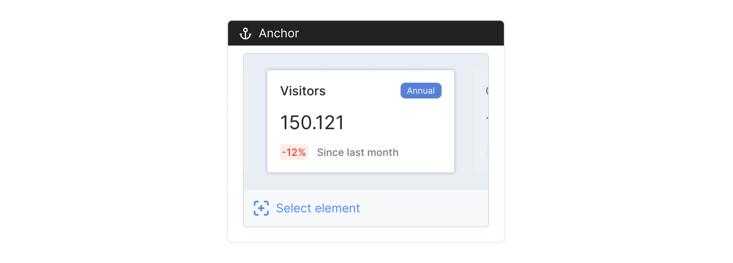
Tooltips provide a great way to call out specific elements on your Capture to draw a users attention to a specific menu item, button, chart, table row, ect. After selecting the Tooltip from the Step menu, you will then see a new Anchor item appear on the Step card. An anchor will be the element on the Capture that the Tooltip will point to.
Prior to selecting an anchor, you must select the associated capture.
Selecting an anchor from your capture
Once you select "Select another element" from the Anchor menu in the Step card, a new tab with your capture will open in your Chrome browser. You will notice that the page is now in selector view where you can use your cursor to choose the correct anchor element on your page.
Once you select an element, it will appear back in the flow step with a snapshot of the selected anchor item. To change this anchor, simply click the "Select another element" option.
Anchor Options
To open the anchor options menu, click on the black anchor bar. This will open the anchor options side menu.
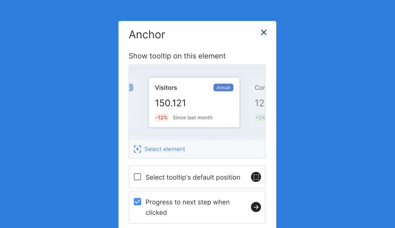
From this menu, you will be able to select a few options for this tooltip step. First, as in the step card itself, you can select a new anchor element. Next, you are able to set a tooltip's default position on the screen. By default, the tooltip will find the space that fits best based on screen size, but if you want to select a default position (above, below, right, left) in relationship to the anchor element, you can do so with this option.
Lastly, from this menu, you can toggle the "Progress to next step when clicked" option. This setting gives you the flexibility to have a user click an element on the capture screen to continue with the walkthrough. If you don't want a user to click on the element to continue, deselect this option, and add a button to continue progression.
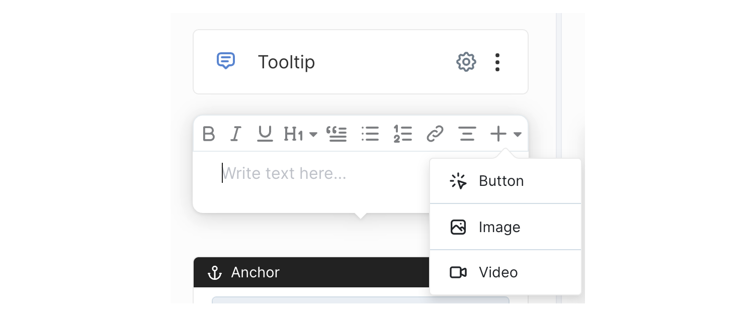
Adding a button to a tooltip
In building out a flow, a button can be a helpful tool for a user to progress to the next step in the sequence. To add a button, select the "+" icon from the tooltip step and select button.
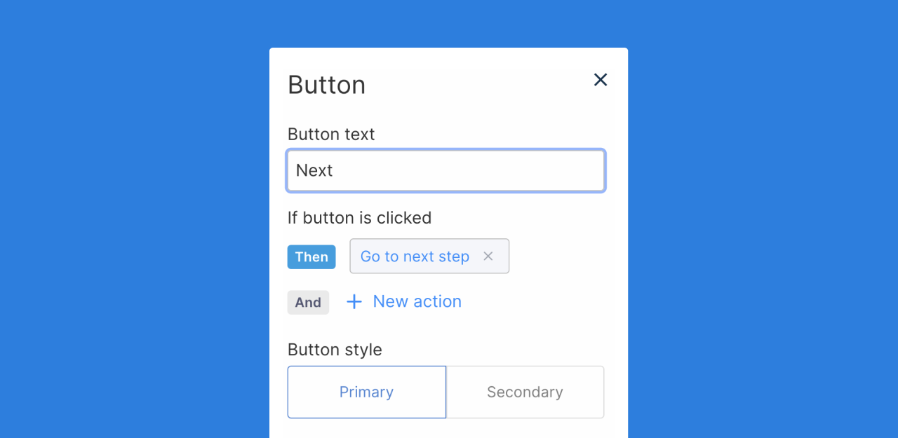
To customize the button settings and actions, select the button from the step to open the Button settings side menu. From this menu, you can change the button text as well as change the desired button action. By default, the button will progress to the next step, but buttons can also be used to complete a flow, start a new flow, or navigate to a page (with a desired URL).
Previewing a Step
If you want to test an individual flow step in preview mode, select the Play button from the step card. This will open a new tab in your Chrome browser where you can preview the individual step.

Previewing a Flow
After you have built out your desired flow, you can preview the flow with the Preview Play button in the top right corner of the flow builder screen. This will open a new tab in your Chrome browser where you can preview the entire flow.
Previewing a flow will load slower than when viewing in a published project

Publishing a Flow
Publishing a flow will save your progress. Publishing a flow will also automatically update any projects assocaited with this flow.
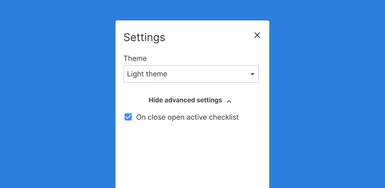
Settings
From this menu, you can assign a theme and toggle the option to open an active checklist once a flow step has closed.
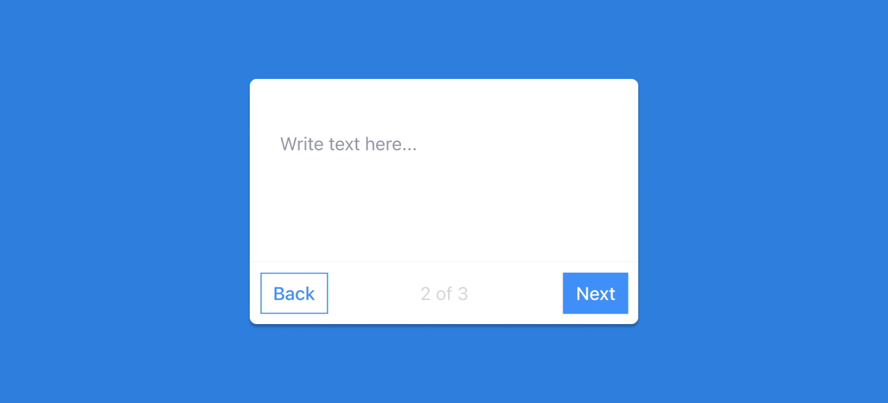
Navigation Buttons
Navigation buttons provide the structure for forwards and backwards navigation across a flow. To turn navigation buttons on, open the flow setting menu and select the "Has navigation buttons" toggle from the Advanced section.
Updating a flow with navigation buttons will remove any buttons or CTAs already in the flow.
As a note, the first step in a flow will not contain a 'back' button and the last step in a flow will not contain a 'next' button by default when previewed.
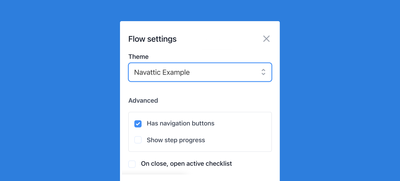
The show step progress toggle will provide users with a reference of progress made in a flow complete with step number and total number of steps.
Navigation actions can also be added to buttons without using the navigation buttons option.
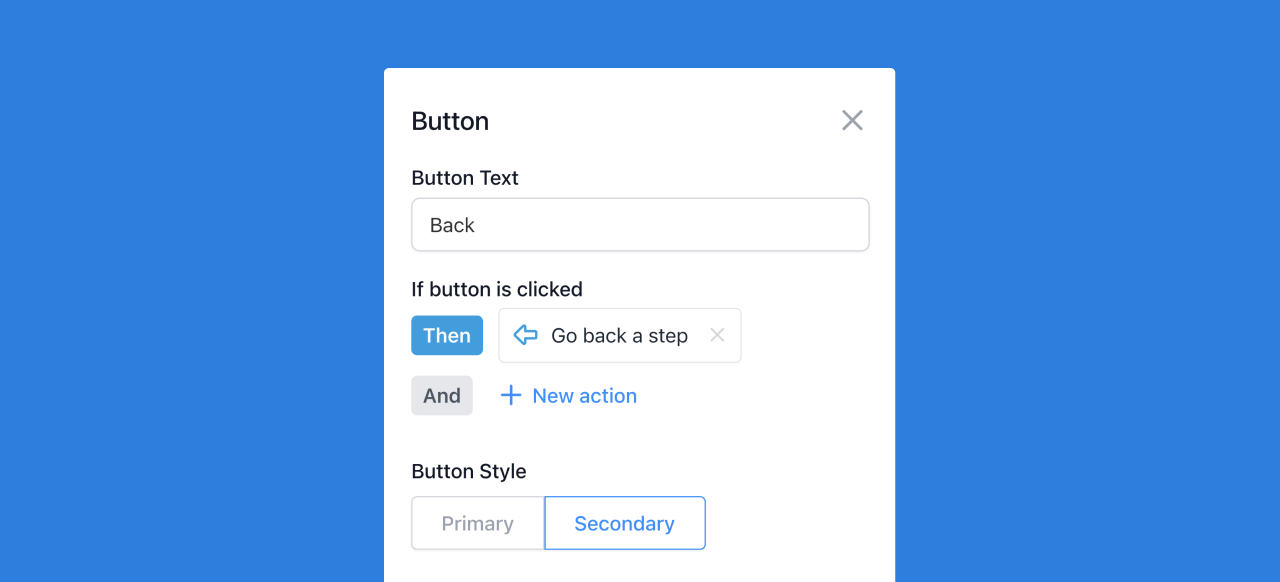
Buttons with forwards and backwards navigation can be used in conjunction with buttons with other call to actions or URL redirects.
Step Appearance
By default, the flow step will appear as a modal on the screen for a viewer. We can change the layout of these steps. To do this, first select the gear icon on the step.
Next, we can select a new Step Appearance to change the selected step type. From this menu, we can also add a backdrop to a step (a darkened background to make the flow step really pop) or mark the flow as completed when the step is visited (to signal the last step in a flow sequence).
Modal
Tooltip
Form
Checklist
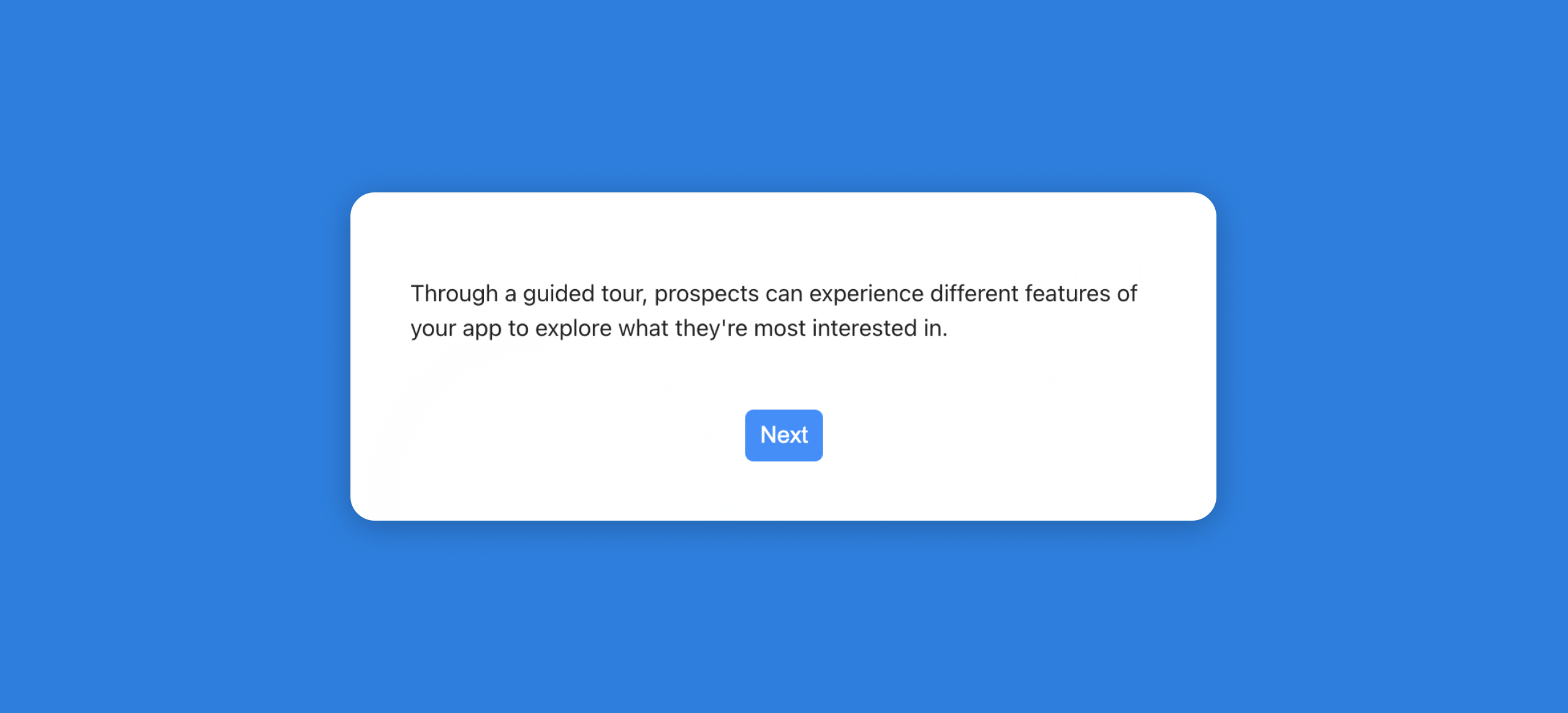
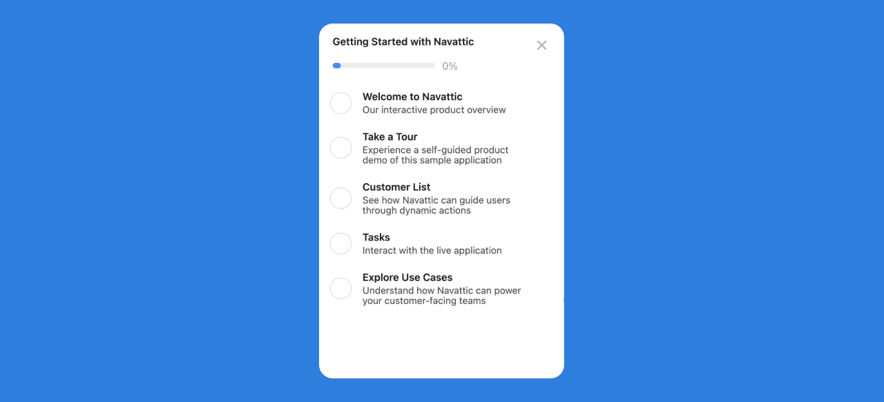
Checklists are a type of Guide to help you organize multiple flows into a single list. This compilation of Flows enables your end users the choice to select (and restart) different flows based on thier needs and interests.
Completing a Flow
When working with Checklists, to have a flow step trigger a checklist item complete, you will need to select the "Mark flow as completed when visited" option in the Step side menu. This will mark the flow as complete on the Checklist when a user gets to this step.
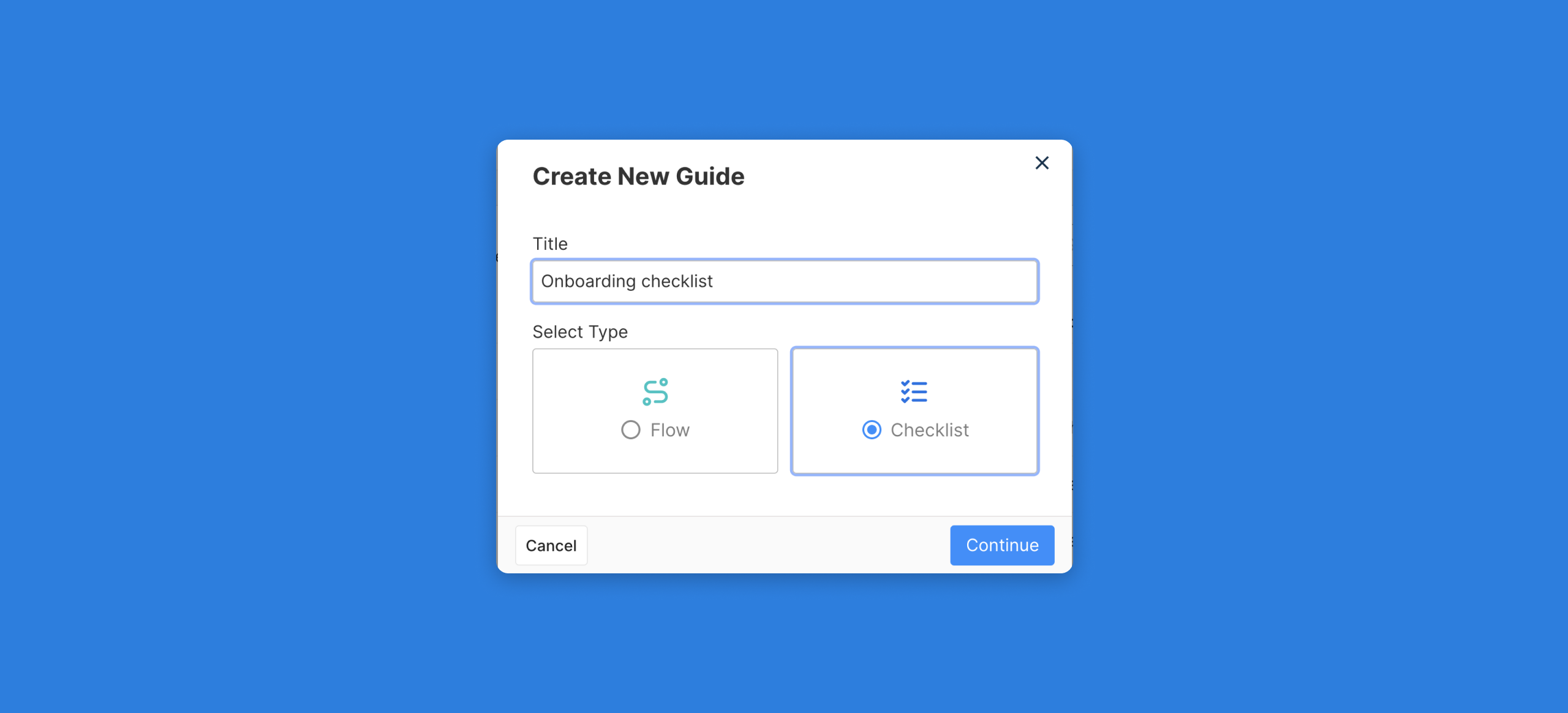
Creating a Checklist
In the guides menu, click Create new to open the Create New Guide menu. From this menu you can choose Flows or Checklists.
A Checklist is a collection of flows organized into a single list view. Checklist can be a great method to organize multiple flows to showcase different features, use cases, or persona overview for your interactive product overview.
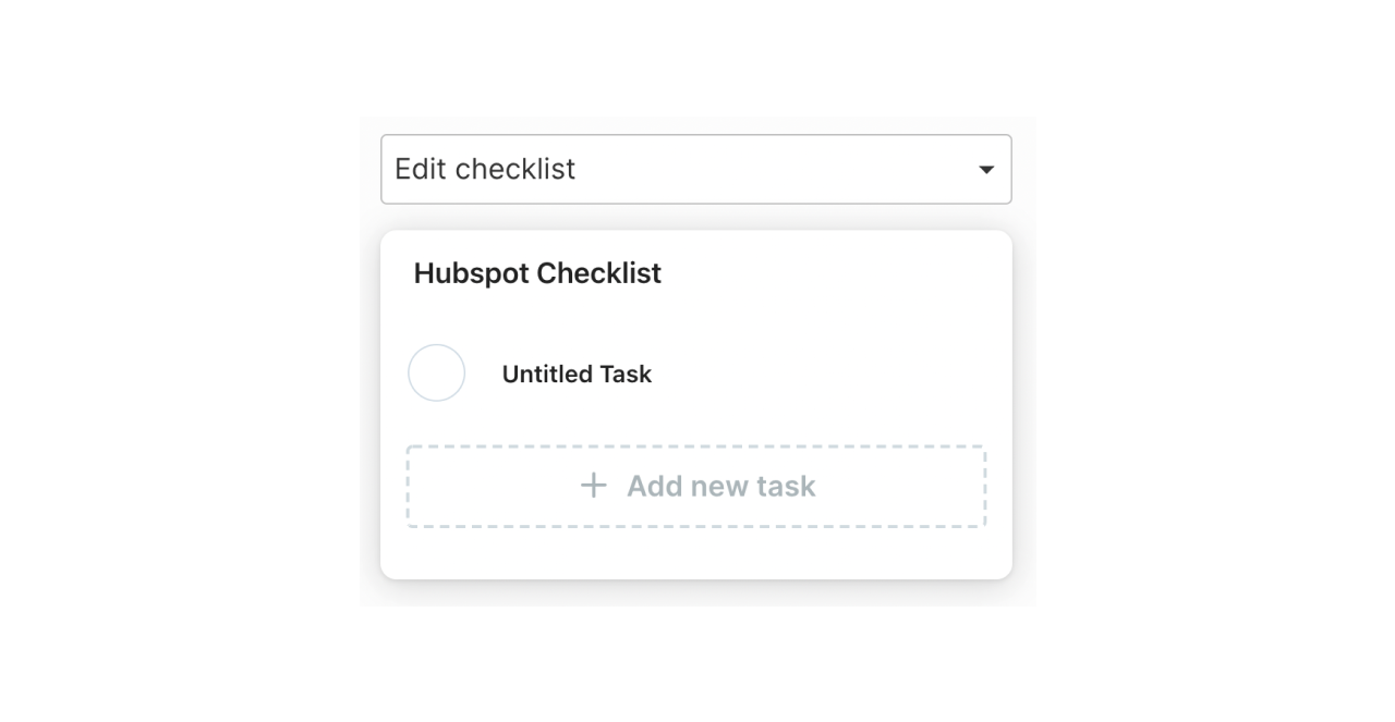
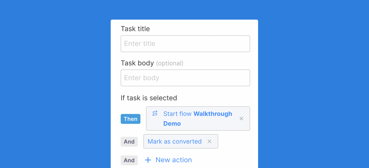
A checklist will contain different tasks for a user to complete when viewing your demonstration. To change a task on a checklist simply select the task from the checklist preview to open the task side menu.
Selecting a task from a menu can trigger different actions based on preference. Selecting a task from a checklist can start a flow, navigate to a page (with a designated URL), or mark an action as converted (to track conversion actions such as leading a prospect to a demo site). A task can start multiple actions.
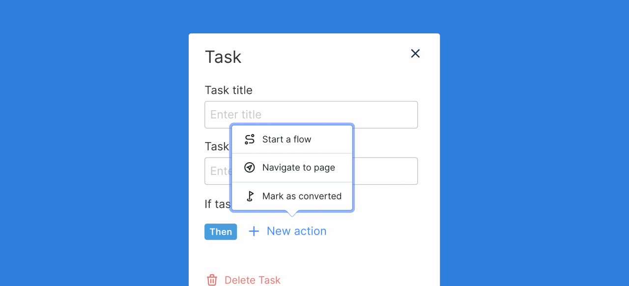
If the desired action is to start a flow, select the "Start a Flow" Trigger Action option and select the correct flow from the "Link to flow" dropdown to choose the correct flow that you have previously built.
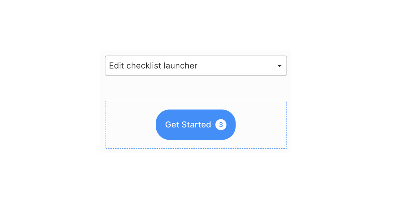
Editing the Checklist Launcher
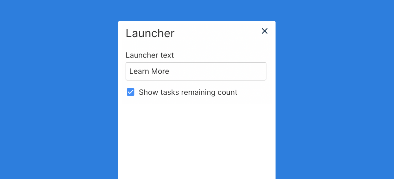
The checklist launcher (the button to open a checklist menu) can also be customized. From the 'edit checklist launcher' dropdown choice, clicking into the Checklist launcher will open a side menu.
From this menu, you can change the text as well as toggle the settings to show or hide the remaining task count.
Beacons
A beacon is an element that can be used to subtly call attention to a specific element without using a tooltip.
Working with Beacons
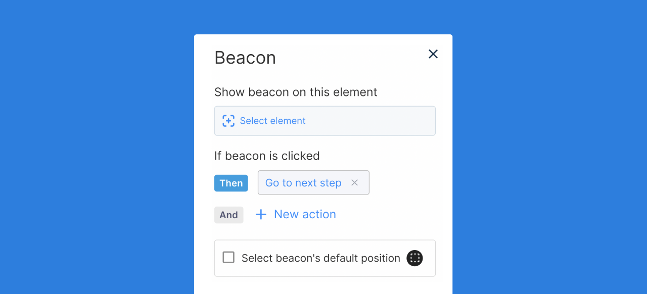
To add a beacon element to a step, from the Flow builder select the "Add beacon" button on the bottom of the step.
Next, select the desired element that you want to call attention to using the beacon.
Once you have selected the element from your Capture, you can select the default beacon position by opening the Beacon menu (clicking on the purple beacon bar) and selecting the checkbox "Select beacon's default position".
Working with Invisible Steps
Beacons can be used in conjunction with tooltips and modal elements, but the invisible step enables the Beacon to be the only element on the screen. To change a step to Invisible, open the Step menu and select "Invisible" from the Step Appearance selection.
This gives a subtle way to guide a user to the next step in a workflow when a tooltip or modal element is not desired.
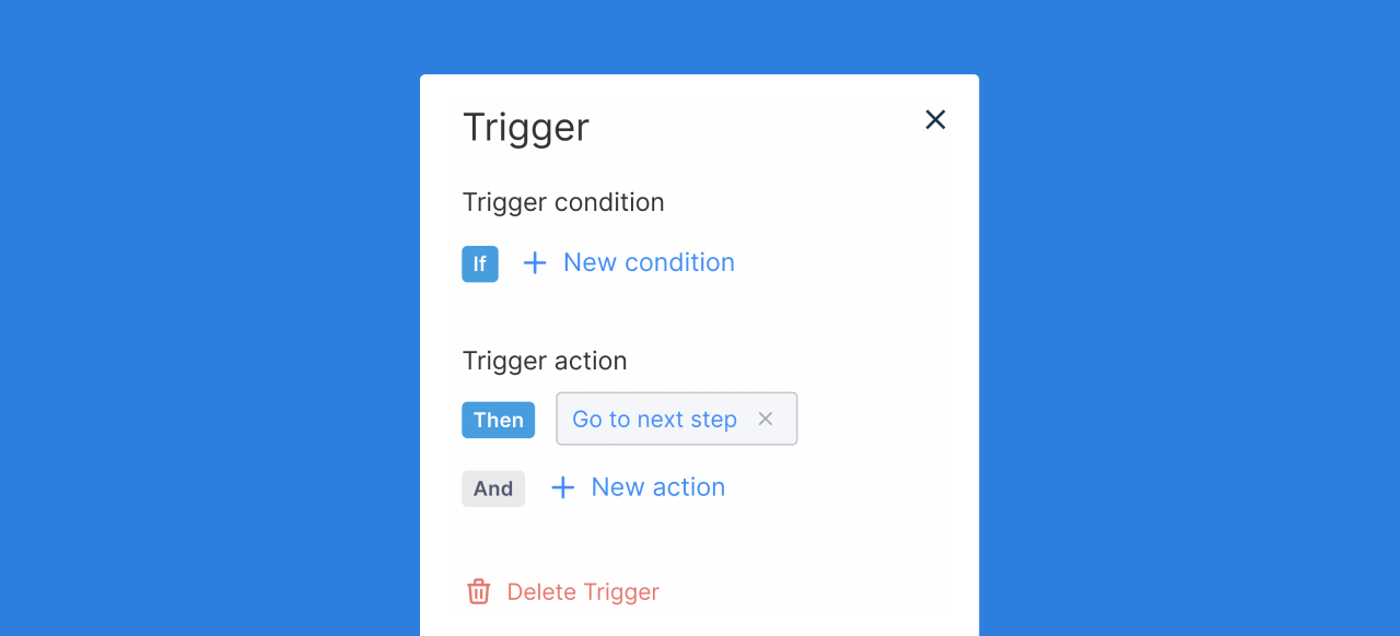
Triggers
A trigger is an element that can be used to wait for a user input before progressing a flow forwards.
Working with Triggers
To add a trigger to a step, from the Flow builder select the "Add trigger" button on the bottom of the step.
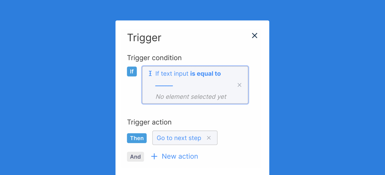
Next, select trigger condition: element or text input.
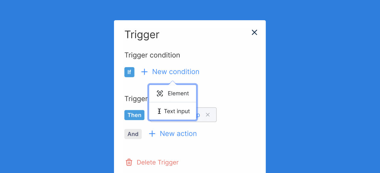
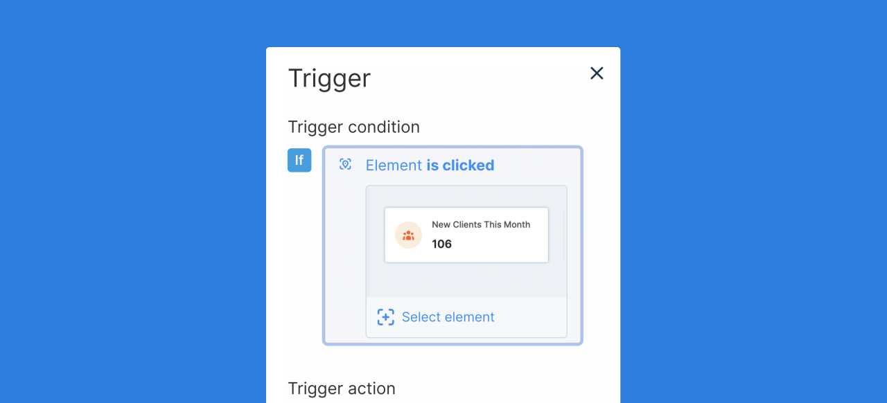
Element Triggers
An element trigger will wait until an element has been selected to take a set action. Once you have selected the element for your trigger, select the desired trigger action.
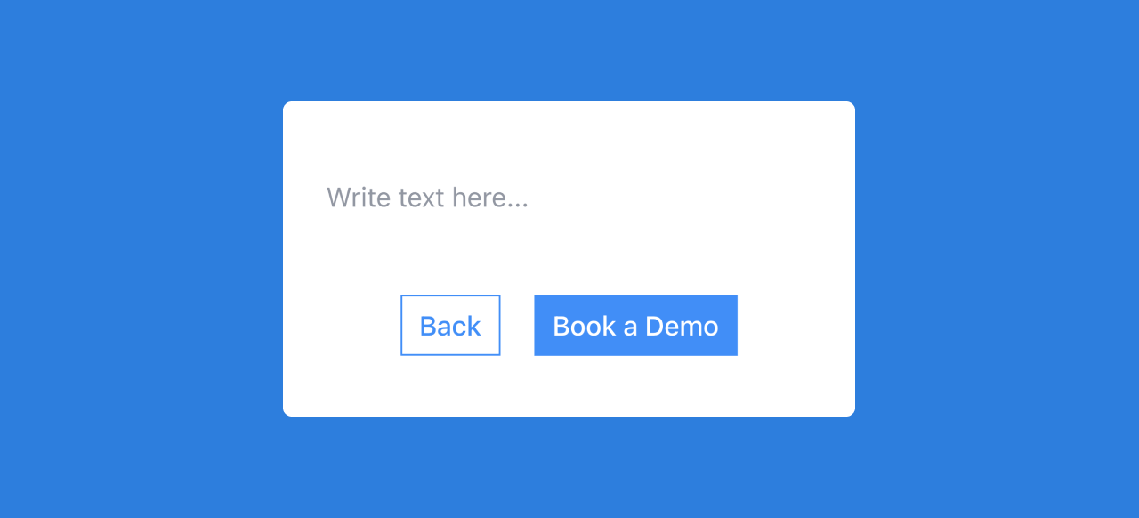
Text Input Triggers
Text input triggers can be helpful if you want a user to enter a desired string of text before progressing or taking the next action in a flow. Once you have selected the text input field on the capture, enter the desired text string.
This will prevent your flow from moving forward or taking until a desired text input has been added.