Themes
Themes provides teams with the structure to update and modify the look and feel of a Navattic interactive demo. Users can change color, button shapes, backdrop color, and more to create a custom theme to match their brand identity look and feel.
Theme builder
To begin, navigate to the Themes tab in the left hand navigation sidebar. From the Themes page select, "Create new" to build your first theme. Give the theme a title, a template theme, and choose if you would like the theme to be the default for the workspace.
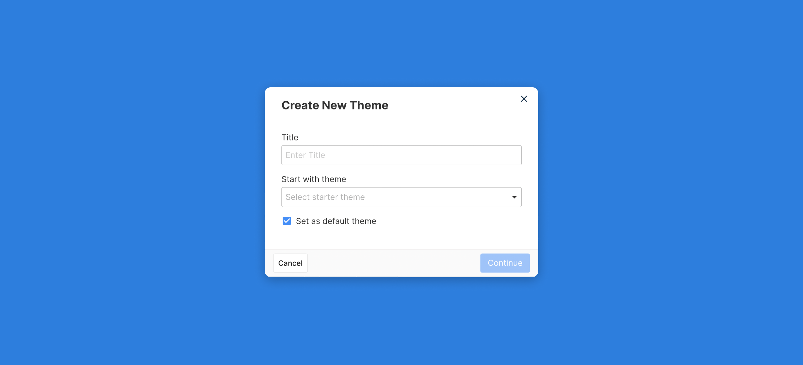
After creating the theme, the theme builder page will open to showcase a variety of options to customize the new theme.
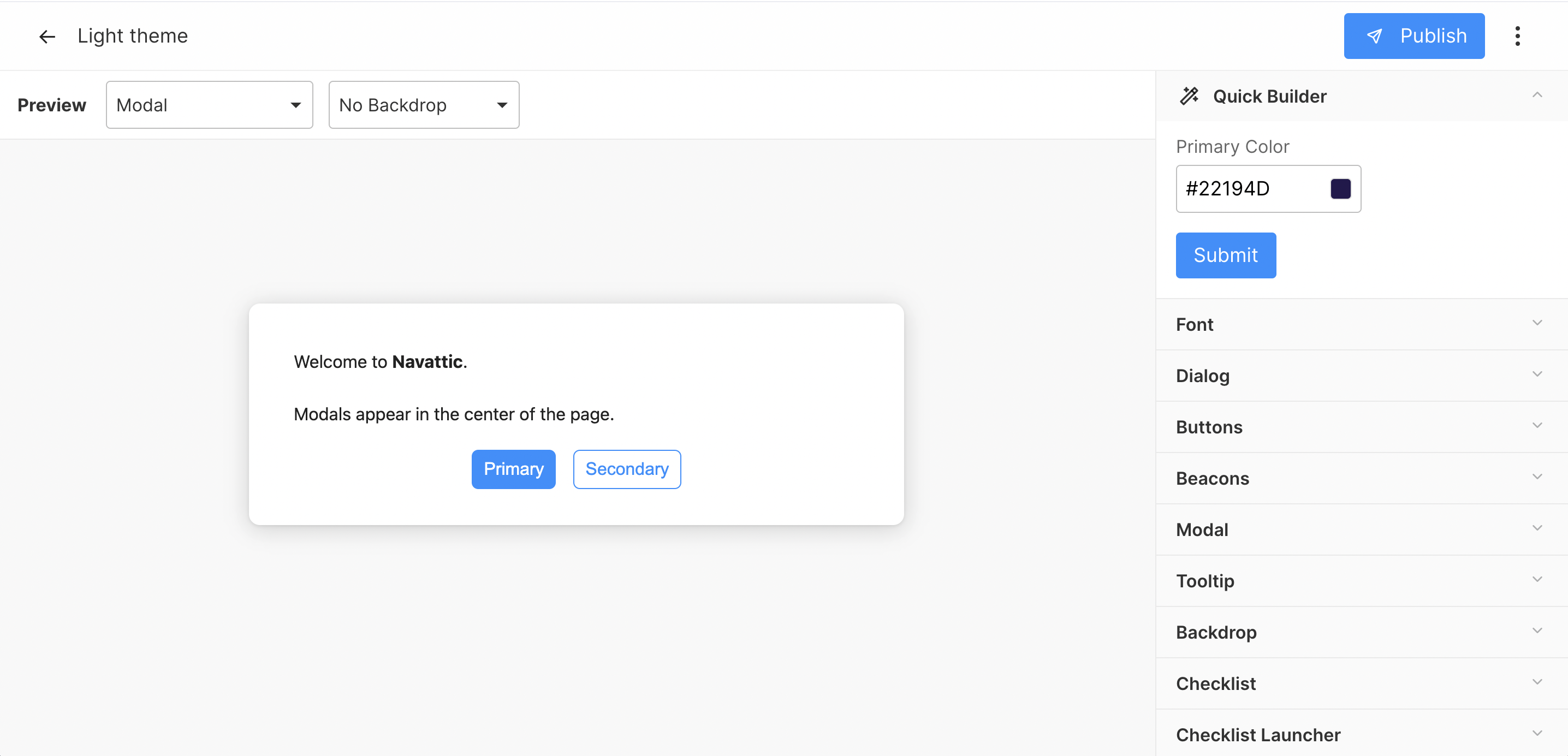
Quick builder
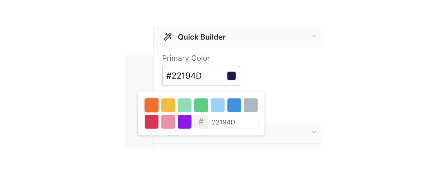
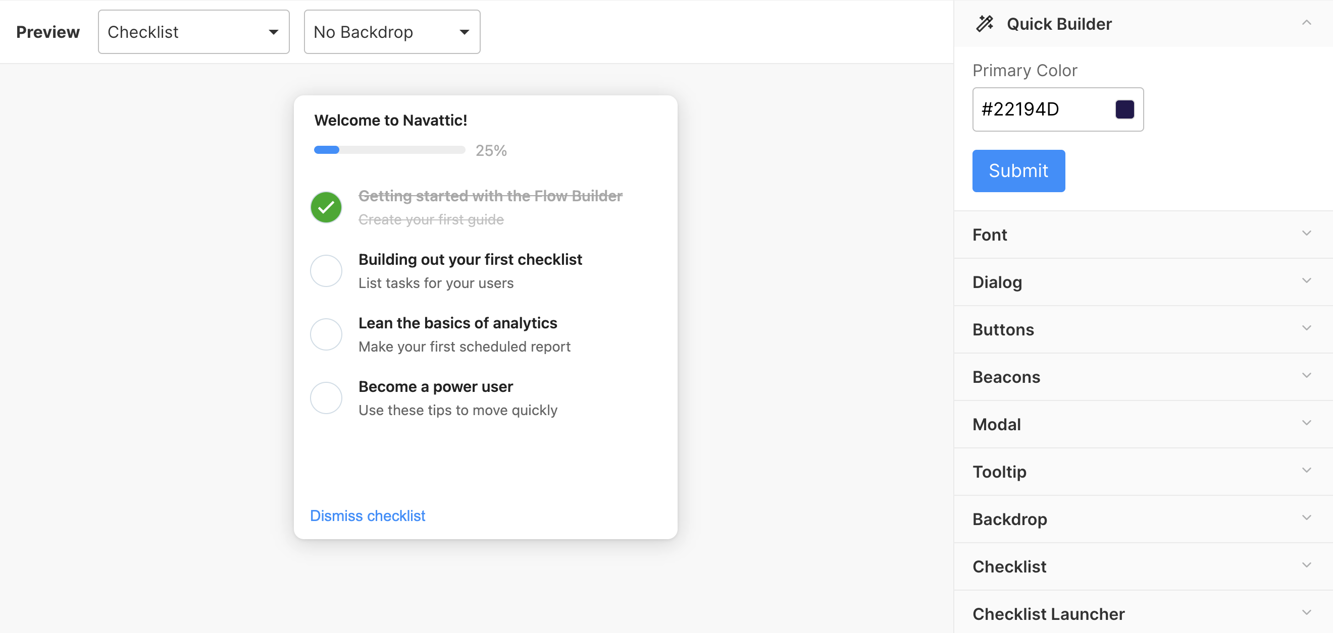
The quick builder feature provides an easy way to modify a theme to a consistent color. Enter in the desired HEX color value and click submit to save. You will notice that the preview immediately changes with the new theme color.
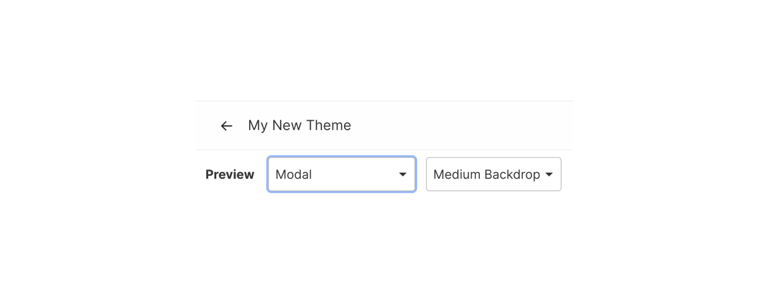
Preview
To change the element you are previewing simply select a new option from the preview dropdown menu. This gives you the ability to quickly see how your theme will look for modal, tooltip, checklist, checklist launcher, and beacon element types. You can also view how a light, medium, or heavy backdrop will appear on a modal or tooltip step type.
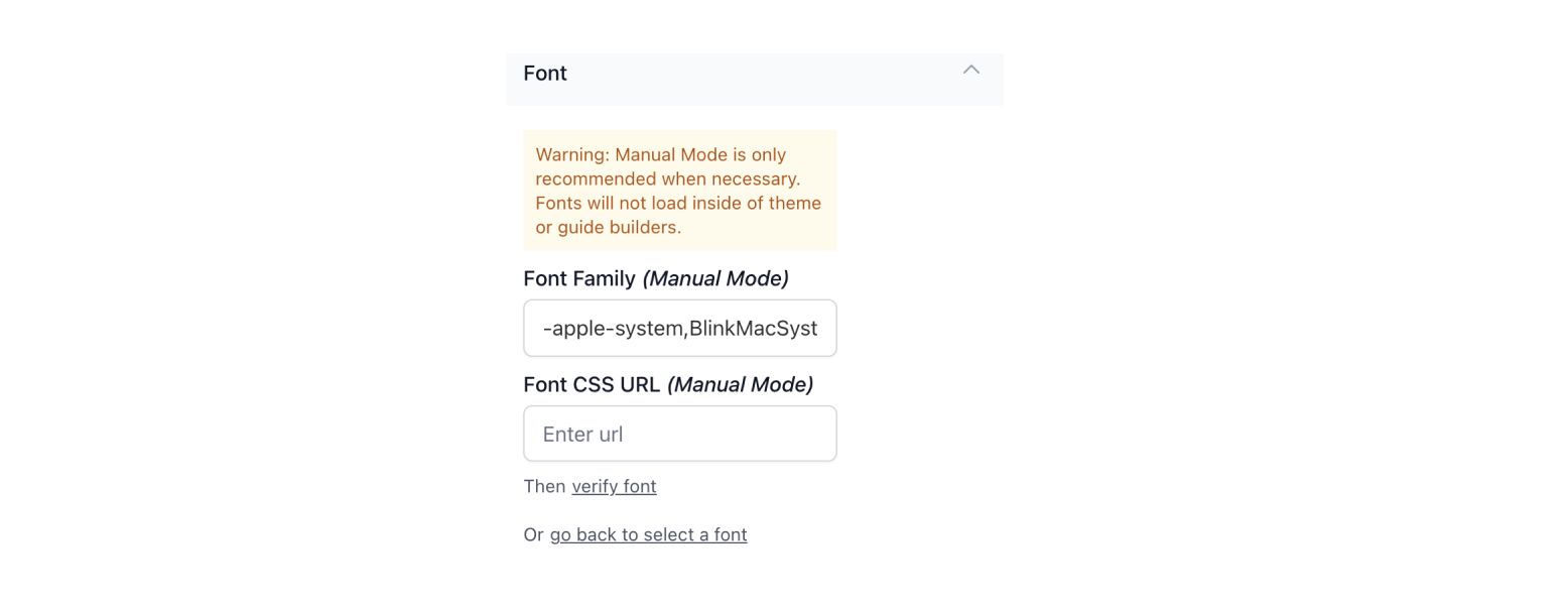
Font
From the font submenu, you can update the default font preferences for step types. You can modify font family (from a list of pre-loaded fonts), color, size, height, and link color.

If your font is not supported by default, you can select the "add a font manually" option to define the font family property and font CSS URL property for the desired font. Once ready, verify the font and you can then save your updated theme.
Please review this helpful resource for more information on font properties.
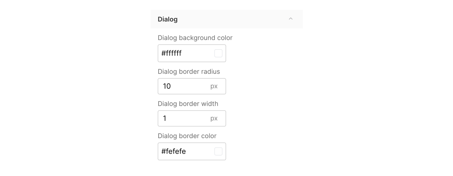
Dialog
From the dialog submenu, you can update the dialog box setting for modal and tooltip step types. You can modify background color, border radius, border width (on or off), and border color.
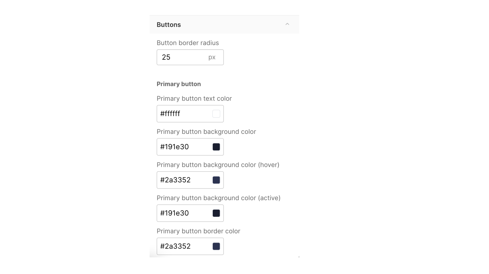
Buttons
From the buttons submenu, you can update the buttons settings for both primary and secondary buttons. You can modify button border radius, default text color, background color, hover color, active color, border color, and font weight.
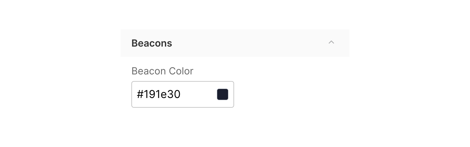
Beacons
From the beacons submenu, you can update the beacon color for the theme.
Modals and Tooltips
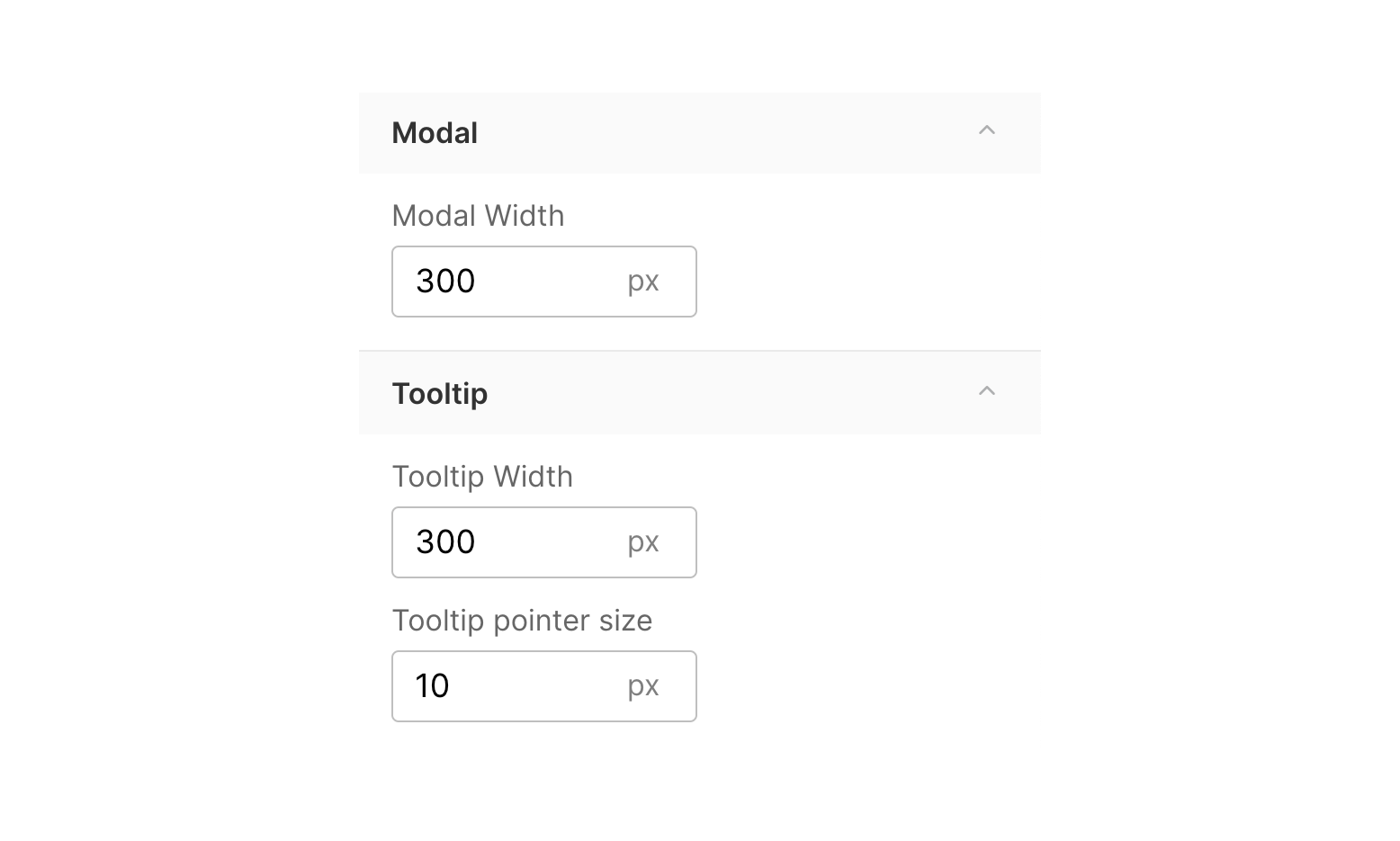
From the modal and tooltip submenus, you can update the default modal and tooltip width (in pixels) for the theme. The modal and tooltip height will dynamically change based on the amount of text in the dialog box. You can also update the tooltip pointer size from this submenu.
Backdrop
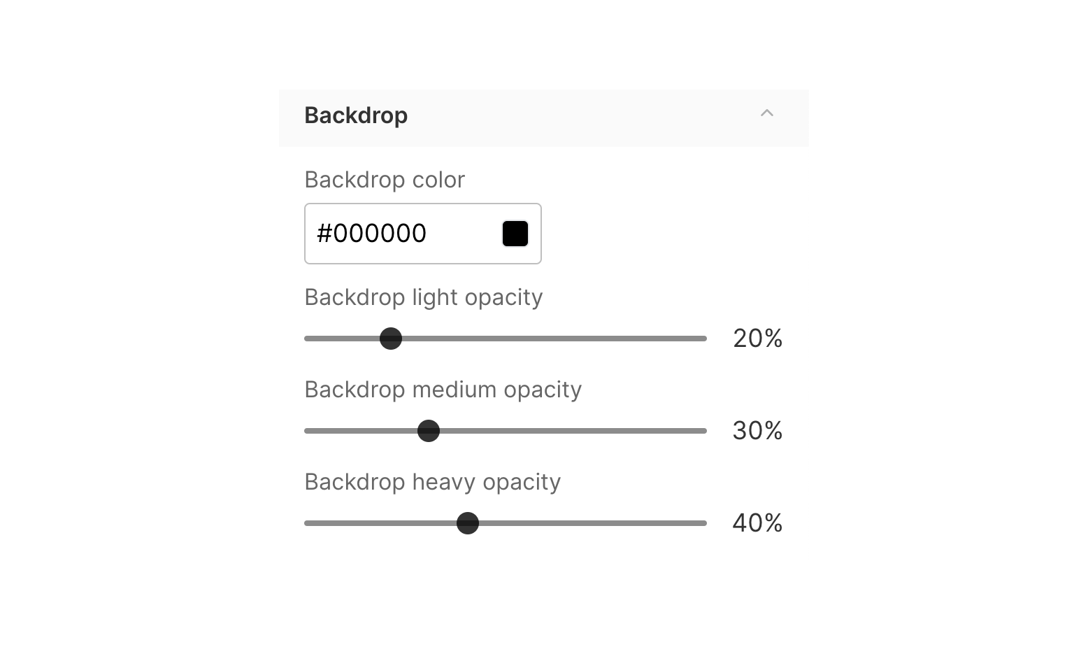
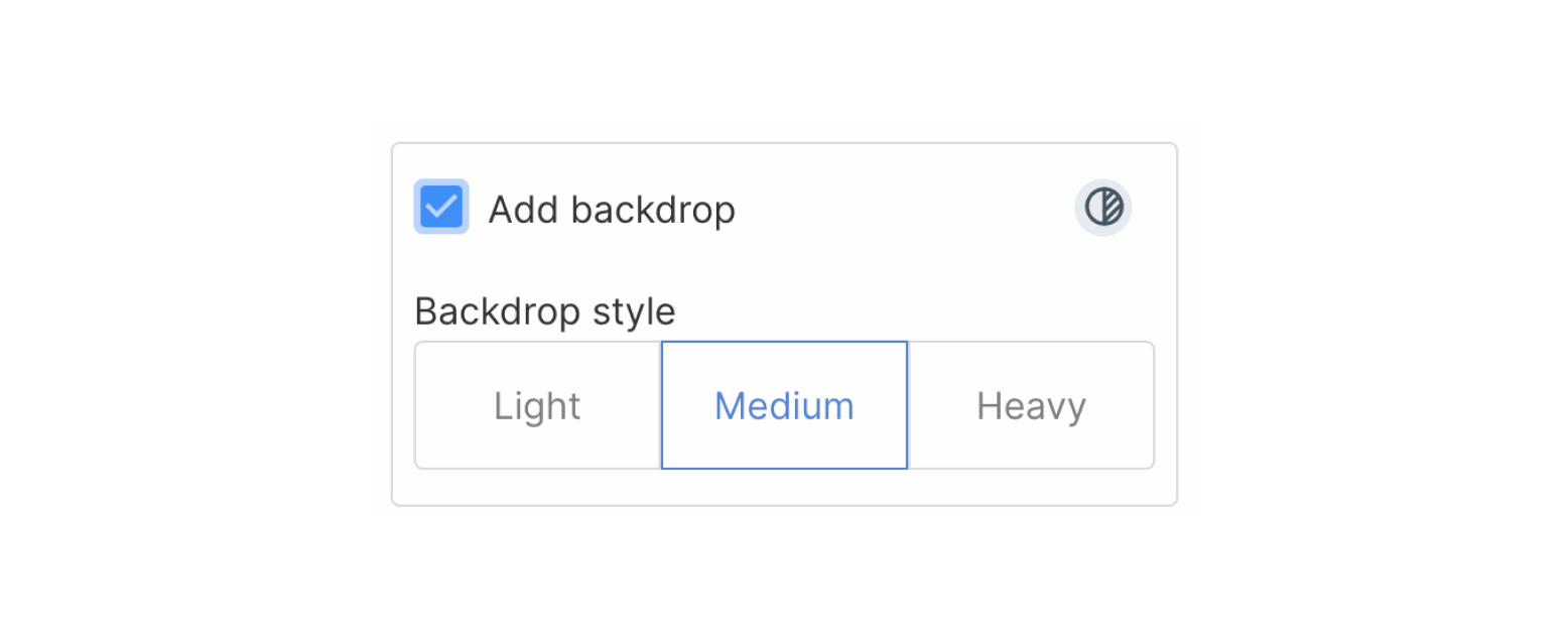
From the backdrop submenu, you can update the backdrop color and default opacities for light, medium, and heavy backdrops.
These can be selected in the backdrop toggle when setting a step appearance in the Guide builder.
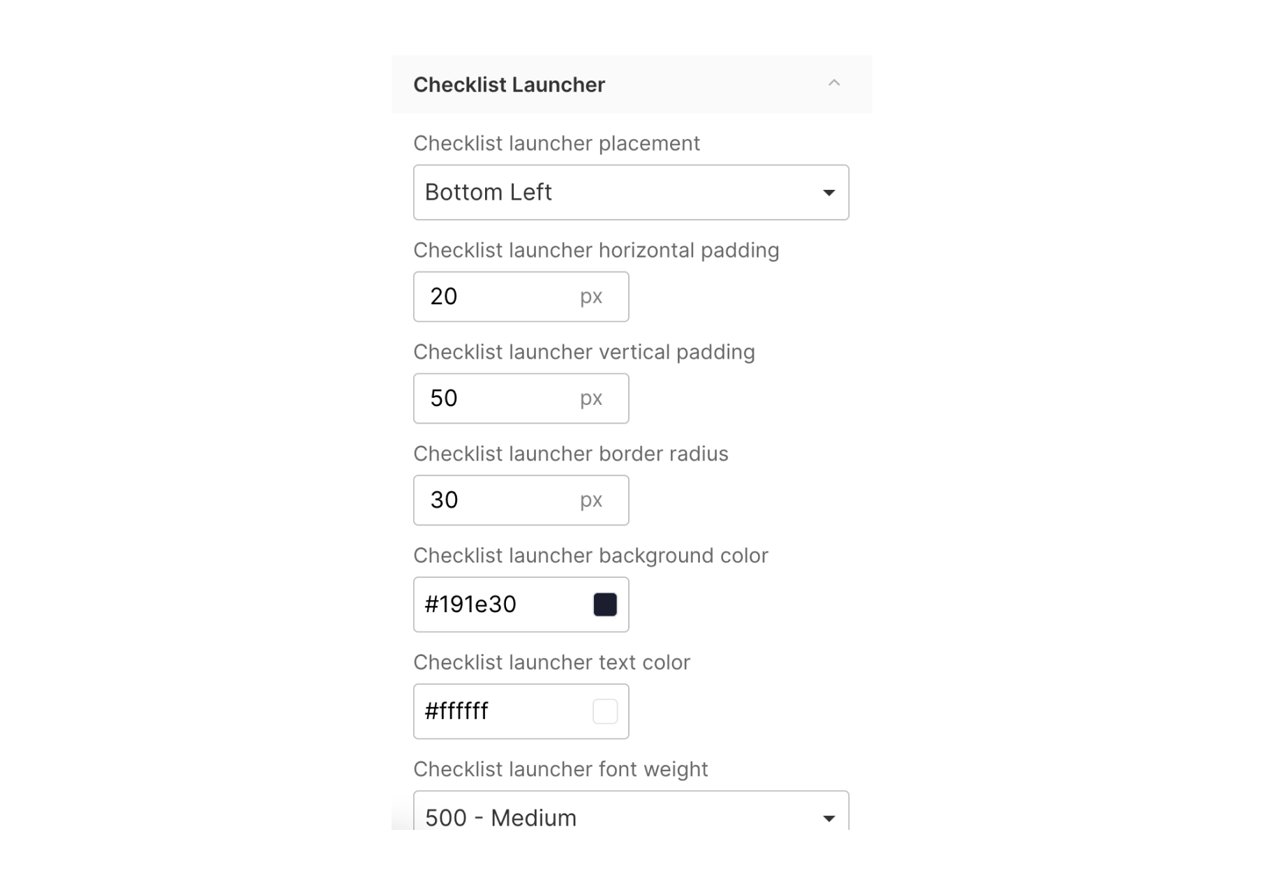
Checklist and Checklist launcher
From the checklist submenu, you can update the checklist placement, padding from the corner of the screen (both vertical and horizontal), checklist checkmark color, and task completition appearance.
From the checklist launcher submenu, you can update the checklist launcher placement, padding from the corner of the screen (both vertical and horizontal), border radius, launcher background color, text color, and font weight.
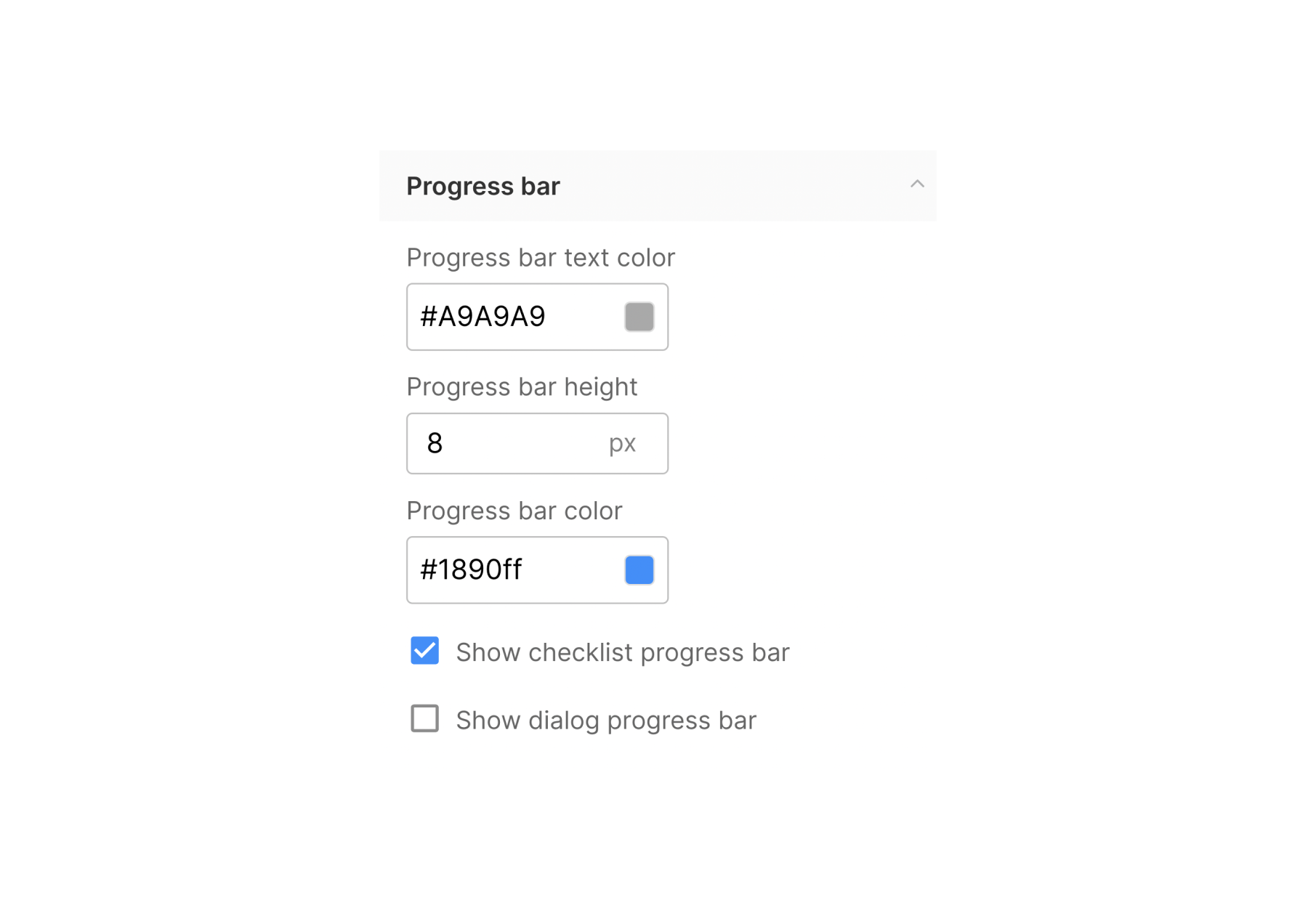
Progress bar
From the progress bar submenu, you can update the checklist completion progress bar text color, height, and fill color.
Selecting a theme
After you have created a theme, you can assign the theme to an existing (or new) flow and checklist. Each flow or checklist can be aligned to one theme. You can have different themes for different flows and checklists within your workspace.
Default themes
When a theme is set to the default, each new flow and checklist in the workspace will use the default theme unless otherwise specified.

Flows and Checklists
Once you have built a theme, you will need to assign this new theme to each existing flow and checklist in your workspace.
To assign a theme, first navigate to the flow in the Guides menu. Once in the flow builder, select the Settings option in the top right corner.

From the settings side menu, choose the desired theme from the Theme dropdown selector.
Once a Theme has been assigned, click publish to save the flow or checklist.
Once you update a flow or checklist with a new theme, it will automatically update to any associated projects (including live Projects)